Tote (Grocery Delivery)
UI/UX Accessible App
Tote provides simple, efficient, and safe grocery delivery services for people to purchase essentials from their local grocery stores at any time. Additionally, the app is designed to be accessible to individuals with 20/70 vision, color blindness, and dyslexia through heavy emphasis on color and typographic studies.
My roles: UI/UX design, type measurements, competitive audit, user personas, and photography
Team: Bryan Gomez, Peggy Zisk, and Shameem Ahmed
What does it mean to have 20/70 vision?
According to the American Foundation for the Blind, "[a] visual acuity measurement of 20/70 means that a person with 20/70 (impaired) vision who is 20 feet from an eye chart sees what a person with unimpaired (20/20) vision can see from 70 feet away."
What is dyslexia?
Individuals with dyslexia have a language learning disability that interferes with their ability to correlate the letters seen with spoken sounds; as a result, this causes reading to be difficult and slowed. Additionally, struggles with memory and mentally organizing information is often common with dyslexics.
User Personas
Personas were created to ensure user needs are met by the design of the app.
Competitive Audit
A few popular grocery delivery service apps are studied in both analyses. The UI analysis consists of branding aspects while the UX analysis includes key features in each app.
Color Palette
Each color’s y-tristimulus value is measured based on its distance from white (100) using the Classic Color Meter app downloaded from the App Store on Macintosh computers.
Accessible Color Combinations
Combinations with a y-tristimulus differential of 40 or more and a minimum luminance contrast ratio of 4.5 between the background and foreground color indicates that there is enough contrast. Luminance ratios are calculated using the Planetcalc website to distinguish how easily a human is able to recognize text or images in the foreground on a colored background.
Color Blindness Views
Using the Color Blindness Simulator on the Color Blindness website, this shows the viewing perspectives according to each color blindness type.
Red-Weak/Protanomaly
Each color’s y-tristimulus values are measured again, and luminance ratios are recalculated for each combination to confirm their accessibility with each color blindness type.
Typography
Sans-serif fonts and medium or semi bold weights (for body copy) provide better legibility and readability. Using italic and all capital letterforms are avoided as it interferes with the speed of reading for the visually impaired and dyslexics.
Poppins Viewing Distances
Based on color, type weight, and type size, viewing distances are calculated using a formula provided by the Innovation Center for Design Excellence’s White Paper. Only the darker color (lower y-tristimulus number) in color combinations need to be calculated. The following calculations are for black (#000000).
Iconography
Outlined icons must have a minimum 2 point stroke. In order to ensure the readability of the icons, their viewing distances are calculated using the same type viewing distance formula.
Branding Identity
As tote means “to carry something,” our service delivers groceries in reusable tote bags. The logo consists of an abstract tote bag that replaces the “o.” Its simplicity allows it to function as a responsive logo icon.
Images
Objects are masked and placed on a light background to maintain a simple and clean look. Color corrections are made to ensure that there is enough contrast between the object and background.
User Journeys
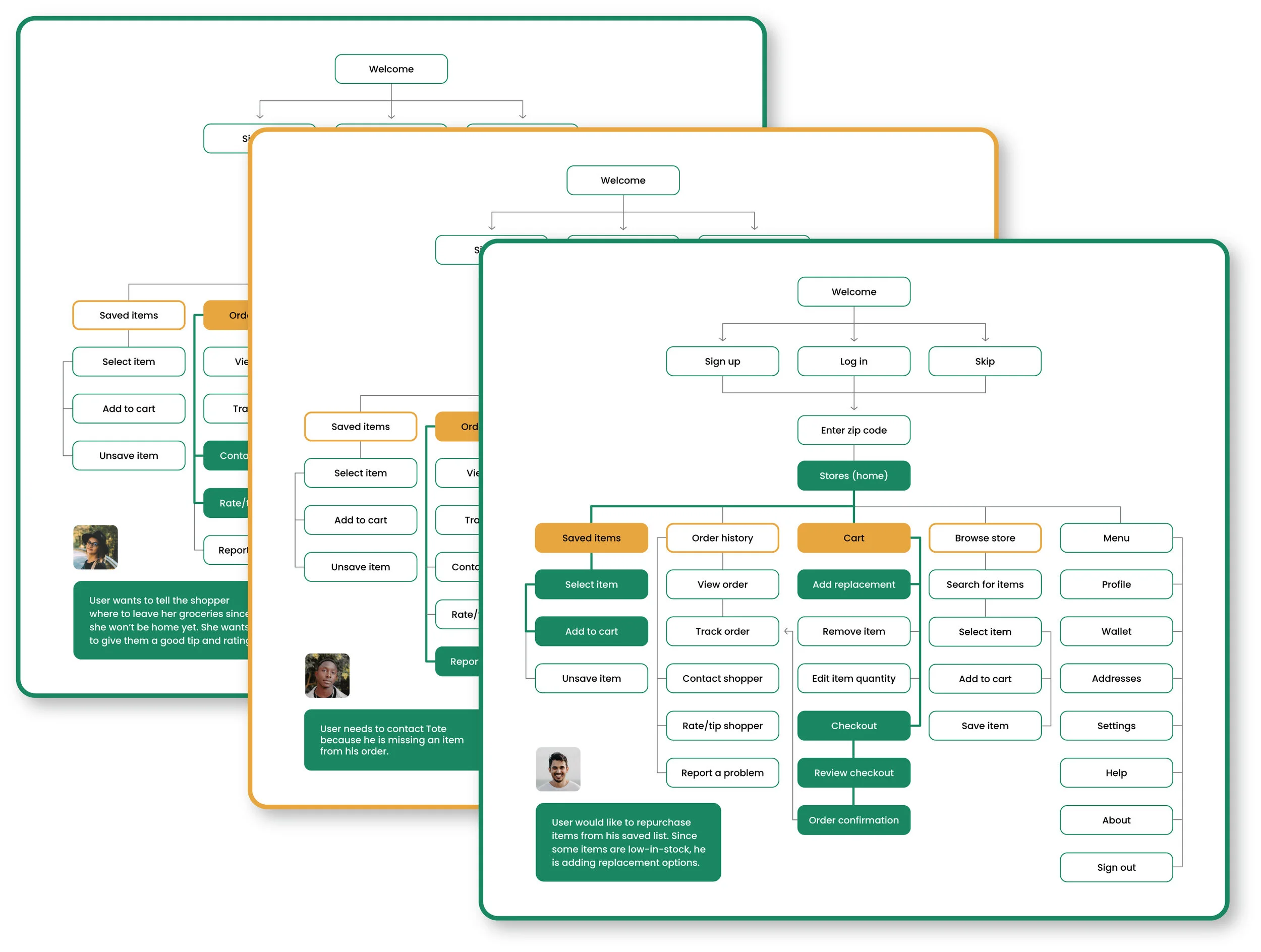
A few user journeys are created to verify that users have convenient access to:
Shopping and placing orders in just a few steps
Tracking their orders
Contacting shoppers and Tote support
Adding substitute items
Saving items for quicker, future purchases
Browsing through the app without having to create an account, first
High-Fidelity Prototype
Tote products created for employees and customers.


