Travel Apps
Accessible UI Tool Kit
Most UI tool kits are designed primarily for users with 20/20 (unimpaired) vision. This travel apps tool kit is created to be accessible to not only users with 20/20 vision but also those with 20/70 (impaired) vision and dyslexia. Colors and typography are core design elements that are focused on in the research to maintain readable, legible, and aesthetic designs.
My roles: UI/UX design and type measurements
Team: Peggy Zisk, Caroleen Suzuki, Amber Corum, Ciara Morris, and Hannah Torres
What does it mean to have 20/70 vision?
According to the American Foundation for the Blind, "[a] visual acuity measurement of 20/70 means that a person with 20/70 (impaired) vision who is 20 feet from an eye chart sees what a person with unimpaired (20/20) vision can see from 70 feet away."
What is dyslexia?
Individuals with dyslexia have a language learning disability that interferes with their ability to correlate the letters seen with spoken sounds; as a result, this causes reading to be difficult and slowed. Additionally, struggles with memory and mentally organizing information is often common with dyslexics.
Color Palettes
A few palette options were put together for users to choose from.
Accessible Color Combinations
Y-Tristimulus values measure the color's distance from white (100) using the Classic Color Meter app downloaded from the App Store on Macintosh computers. This color study (from palette #1) shows color and type combinations that meet the minimum color contrast requirement of 40 for 20/70 vision. Every palette has its own studies included in the kit.
Typography Study
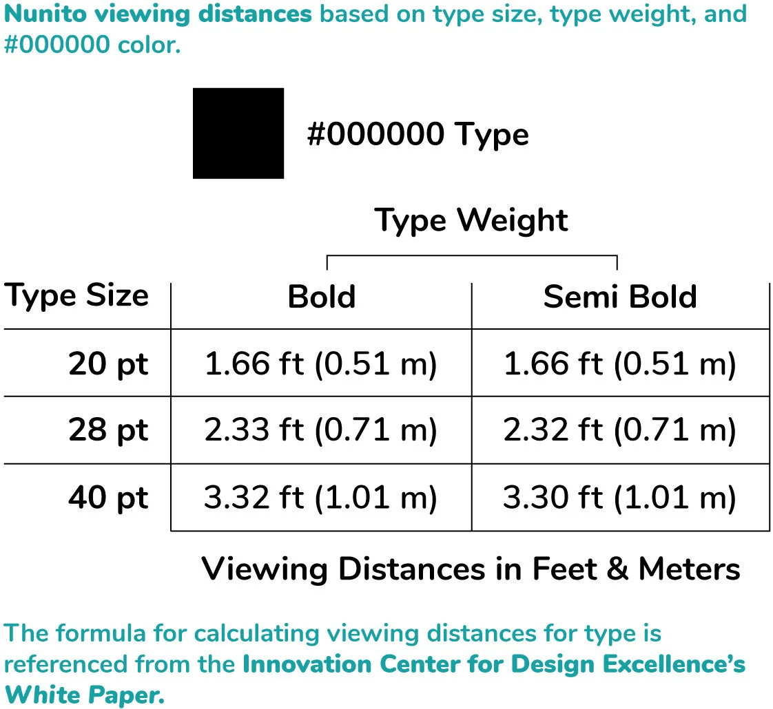
This guide is included in the kit and shows what is used in the layouts. The use of all capital and italic letterforms are avoided as it interferes with the speed of reading with 20/70 vision.
Iconography
Outlined icons must have a minimum 2 point stroke. In order to ensure the readability of the icons, their viewing distances are calculated using the same type viewing distance formula.
Images
Buildings are masked and placed on a light blue background with a 2 point black stroke border to maintain a simple and clean look. Color corrections are made to ensure that there is enough contrast between the object and background.


